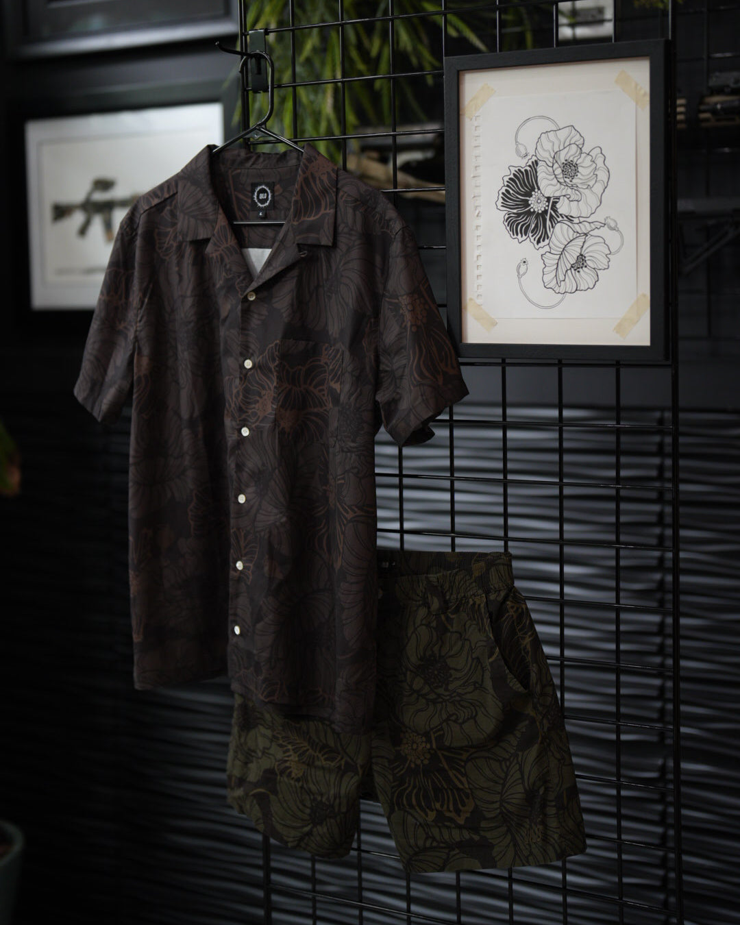
What's great about this Poppy Print is it feels like a pretty simple yet timeless design. The Qilo x Bad Moon collab will once again be featuring this print but in a new color pallet: Black Opium and Gold Hashish.

A little background on creating this print:
Taking a printed photo of real flowers and turning them into something clean and easy to read can take some practice. The key here is pulling out the major features of the pedals and creating separation between the different elements. When working on something like this, I find it easiest to first create outlines of the larger elements with a bold marker. It can be easy to get sucked into drawing every little detail, but doing so will create a flat and muddy design.
Variation of line width is what really brings these designs to life. Especially when you aren't shading. There needs to be some sort of distinction between structure and detail. I do this by creating bold lines to identify shape, and then go back in and create detail with a fine tip pen.
When adding detail to this piece, I had to take some artistic liberties and play with some different linework that was aesthetically pleasing. Obviously, poppies don't have lines run through each pedal. Creating these repeating lines inside the pedals added a level of softness and cohesiveness to the overall piece though, and I liked the way it was looking. It also helped establish form. Line direction helps the eye understand how the pedals are shaped. Having slow, smooth curving lines gives the pedals a flow to them and helps the viewer see how they are shaped.

When the linework was completed, it was time to edit this design in post. I use Adobe illustrator in for workflow.
Without getting deep into the weeds on illustrator, it's a design platform used by many graphic designers in the industry to create and edit designs. I use it mainly to create vector images of things I've drawn so they can be printed across different mediums.

Once the design is scanned and imported into illustrator, I pull apart and copy the elements and begin creating a seamless tiled pattern. This can be a huge headache and can take hours. Essentially what you are doing is making a pattern swatch that can be printed infinitely and will never have a hard-line edge or cut off any of your elements. Anything that runs off the swatch on the left side needs to be mirrored on the right. Same goes for top and bottom. Everything needs to be aligned perfectly.

This process in itself can take a while to learn. Once its complete you end up with a pattern swatch that is seamless and can be printed at an Infinite size with no seem lines or cut off artwork.
During this process is when you also separate the different elements of the design and play with color pallets. For the Qilo x Bad Moon collab, we decided to go with a rich dark chocolate and golden moss color pallet.

